The Black Swan
Between perfection and vulnerability.
Concept · Styling · Image editing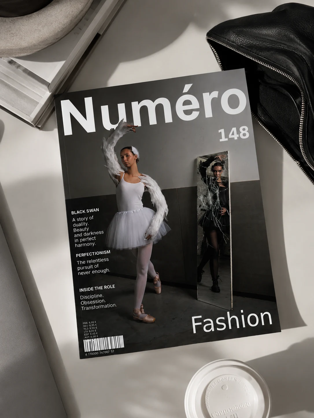
The idea
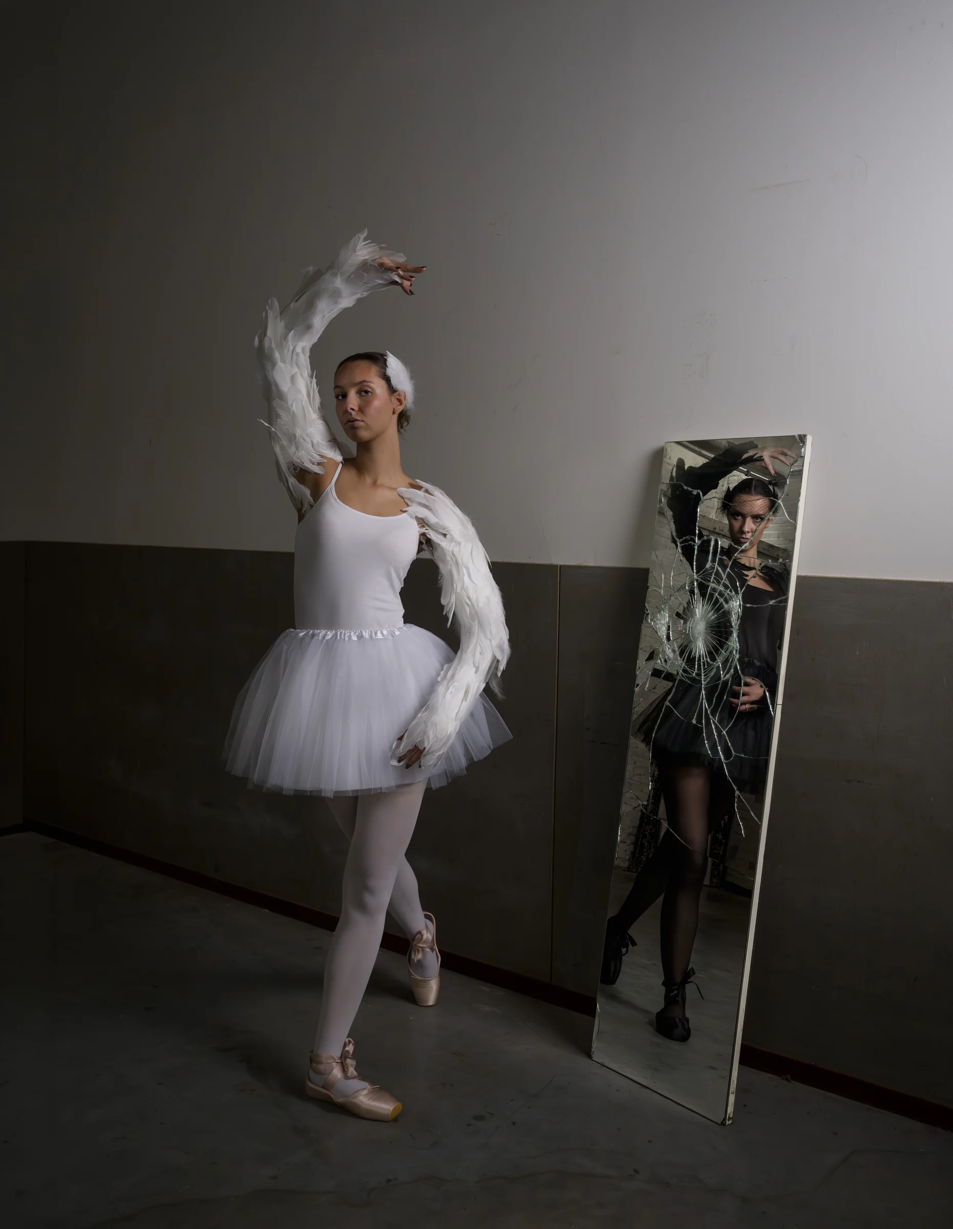
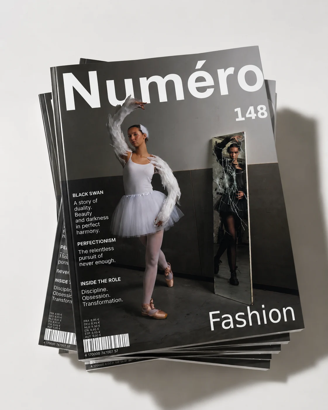
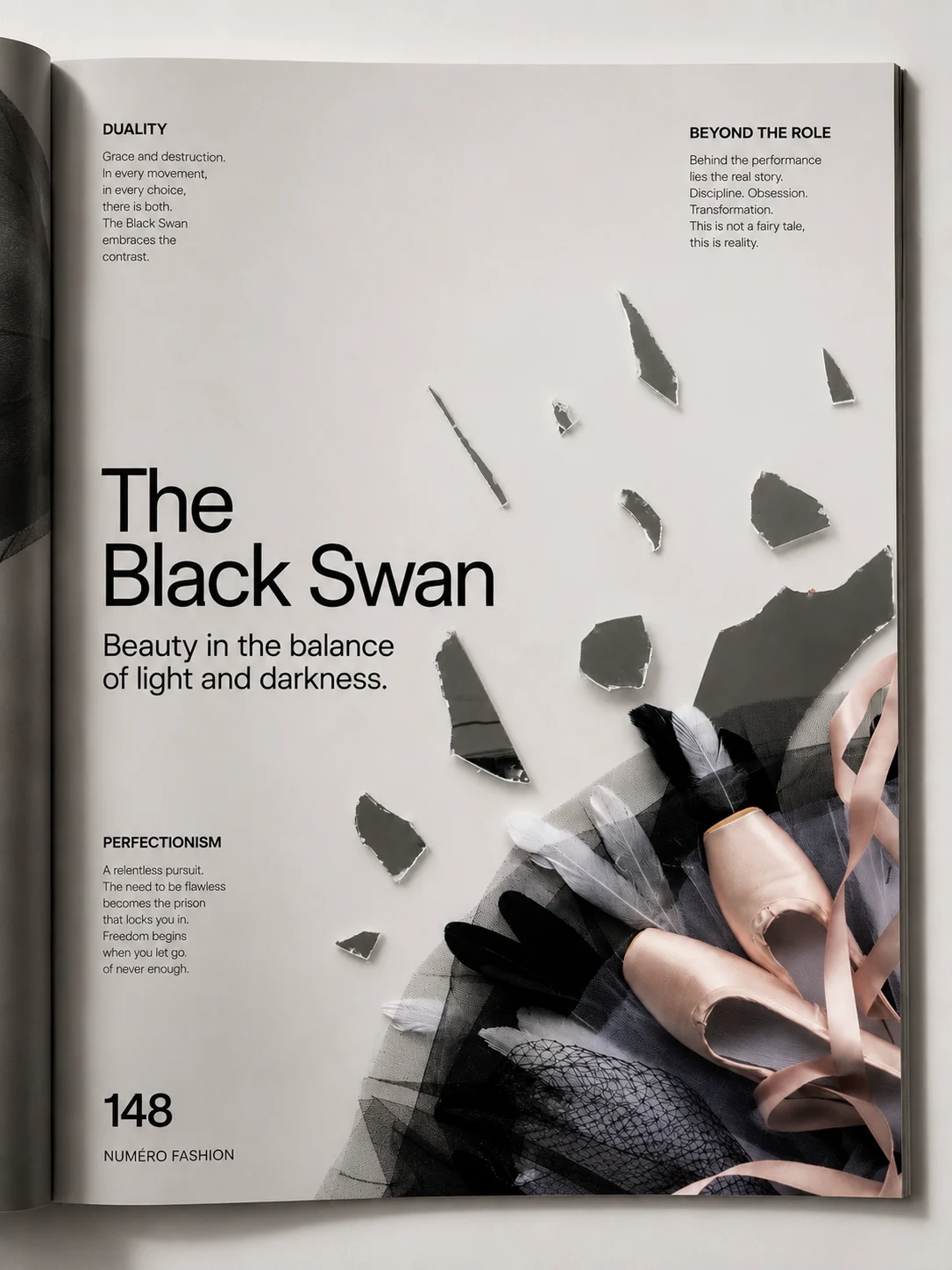
For this project I designed and produced an editorial and flat lay inspired by the film Black Swan. The aim was to create two images that tell one story and fit the visual language of an existing magazine. After researching several titles, I chose Numéro because its artistic, experimental and sometimes dark photography suited my concept.
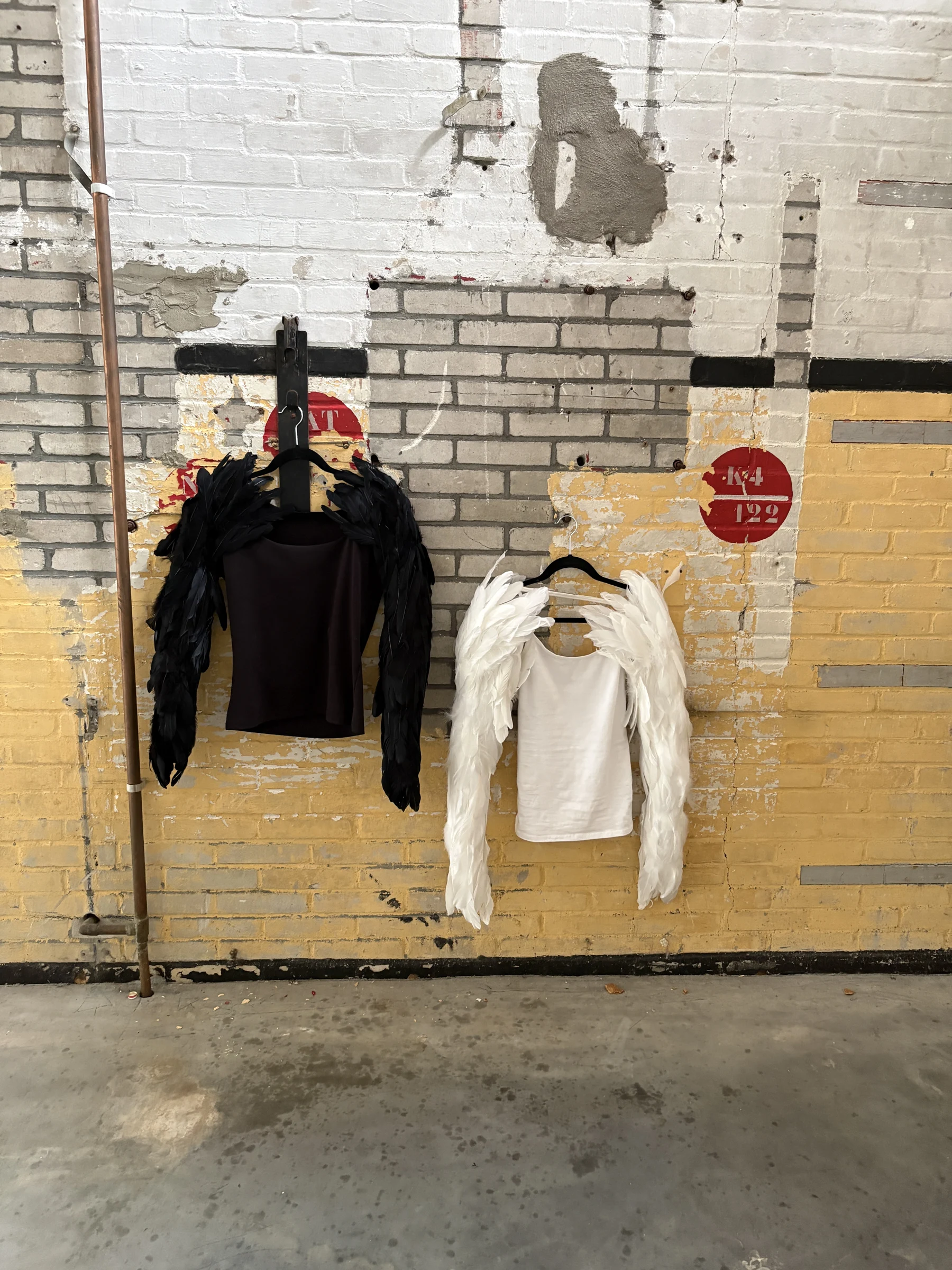
My concept centred on the contrast between the White Swan and the Black Swan. I wanted to move beyond the simple difference between black and white and explore themes from the film such as perfection, vulnerability and the protagonist’s inner struggle. I used black and white clothing, tulle, feathers and ballet elements, with a broken mirror as a central styling element. The shards symbolise a gradual loss of control and the breaking of a perfect image.
Before the shoots I created moodboards, design proposals, call sheets, schedules, shopping lists and a lighting plan. For the editorial I chose a dark, dramatic atmosphere with low-key lighting. The flat lay is calmer, allowing the contrast between black and white to come through clearly.
This project taught me how important it is for concept, styling, location, lighting and composition to reinforce one another. I selected and retouched the strongest images and brought them together in a Numéro layout.
The essence
I brought styling, light and composition together in one story.
The image
The Black Swan emerges between perfection and vulnerability.